
Updating the Mobile App
Problem to solve
The ChargePoint EV charging app had three major shortcomings that adversely affected its performance:
Map functionality was unfocused and failed to provide drivers with simple guidance and data, prompting them to rely on other charging apps
Lack of real-time session feedback diminished user trust and confidence
Inconsistent brand identity of the app, stations, and website affected brand recognition and driver loyalty
These issues led to a fragmented user experience, negatively impacting driver adoption and engagement, making it difficult for ChargePoint to maintain its position as a leader in the emerging EV charging landscape. A top-rated app and a positive driver experience were crucial for closing station sales, auto partnerships and cloud software renewals.
Transforming a 1-star charging app into a top 10 navigation category winner
Insights
As part of our lean and agile UX team of three, I played a pivotal role in shaping the new user interface and design language.
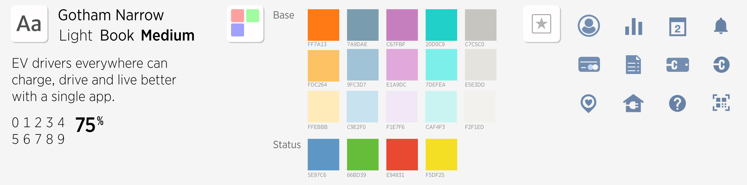
To ensure a cohesive brand experience, I led a collaborative workshop with key stakeholders from across departments. This interactive session helped us define the app's design language, including its voice, tone, and visual guidelines.
Goals
Update visual design, color palette and align them with the corporate style guide.
Give the app a personality and make it more user-friendly.
Add new interactions and touch points for drivers to access data.
Design Directions
Add Splash screen and idle animation to add branding elements and visual delight.
Create a new map design that featured smart station selection and map pins that conveyed availability and station type.
Simplify onboarding screens to reduce sign-up drop-off.
Allow the driver to identify their car model and color for a more personal connection.

Innovations
Added station photos to solve finding a station in the last 100ft
Created Monthly Driver Summary to show drivers the impact of owning an EV
Enable drivers to report problems to help encourage owners to fix stations
Use the driver’s car profile to suggest range and miles added
Convert kilowatts to miles to help drivers understand technical data in a more familiar format
New simplified, simple, data-driven designResults
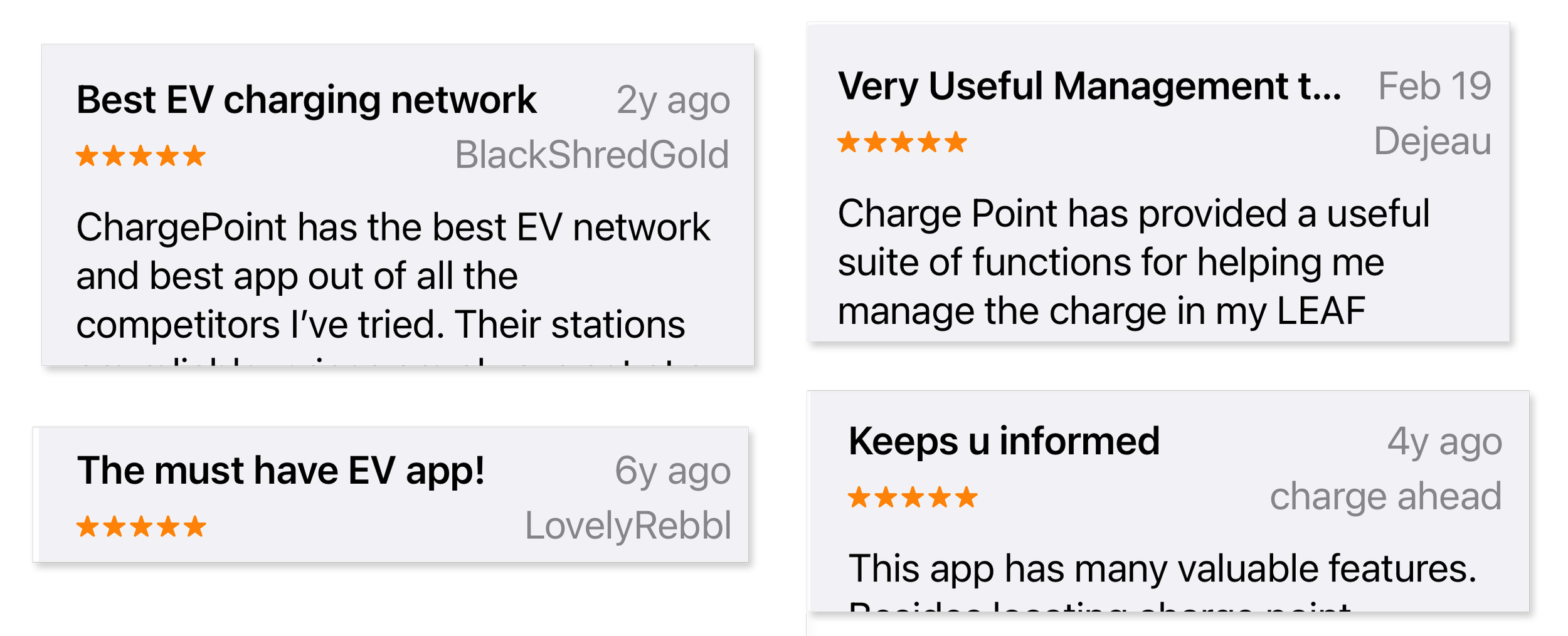
App store rating went from a 1.2 to a 4.7 and increased positive driver reviews
Sign-up drop-off was reduced by 80%
Featured as Apple’s App of the Day
Driver Summary frequently posted on social media, with drivers showing how their EV was saving them money
Apple encouraged Apple Watch integration and was involved in design reviews

Lessons learned
Requiring a credit card during sign-up caused unforeseen friction. Allowing users to skip this step increased app adoption.
There was an assumption that drivers would understand status colors, but they were confused and not confident. Adding the bottom sheet worked as a key to allow users to match color and description, making learning the color coding easier.